Design system & build • 2026

BUILDING THIS SITE

My portfolio, planned, systemized and designed in Figma, then built by hand.

My old site showed my work as promo tiles across a lot of brands. It never got to the brief, the decisions or the outcome. So I set myself a new brief: a dark, minimal base with one signal color, and case studies that walk through the problem, the thinking and the results.

I started with notes and references, turned the decisions into a published Figma library of foundations and components, designed every page from that library, and built the site with Claude as a coding partner. Here’s the whole process, from the messy first page to the shipped site.

01

Planning & ideation

What my old portfolio got right and wrong, notes on what makes a design portfolio work, and early type, color and spacing experiments. For type and spacing, I started from a baseline worked out with Claude, then made the calls myself.

Screenshots of other designers’ work are blurred.
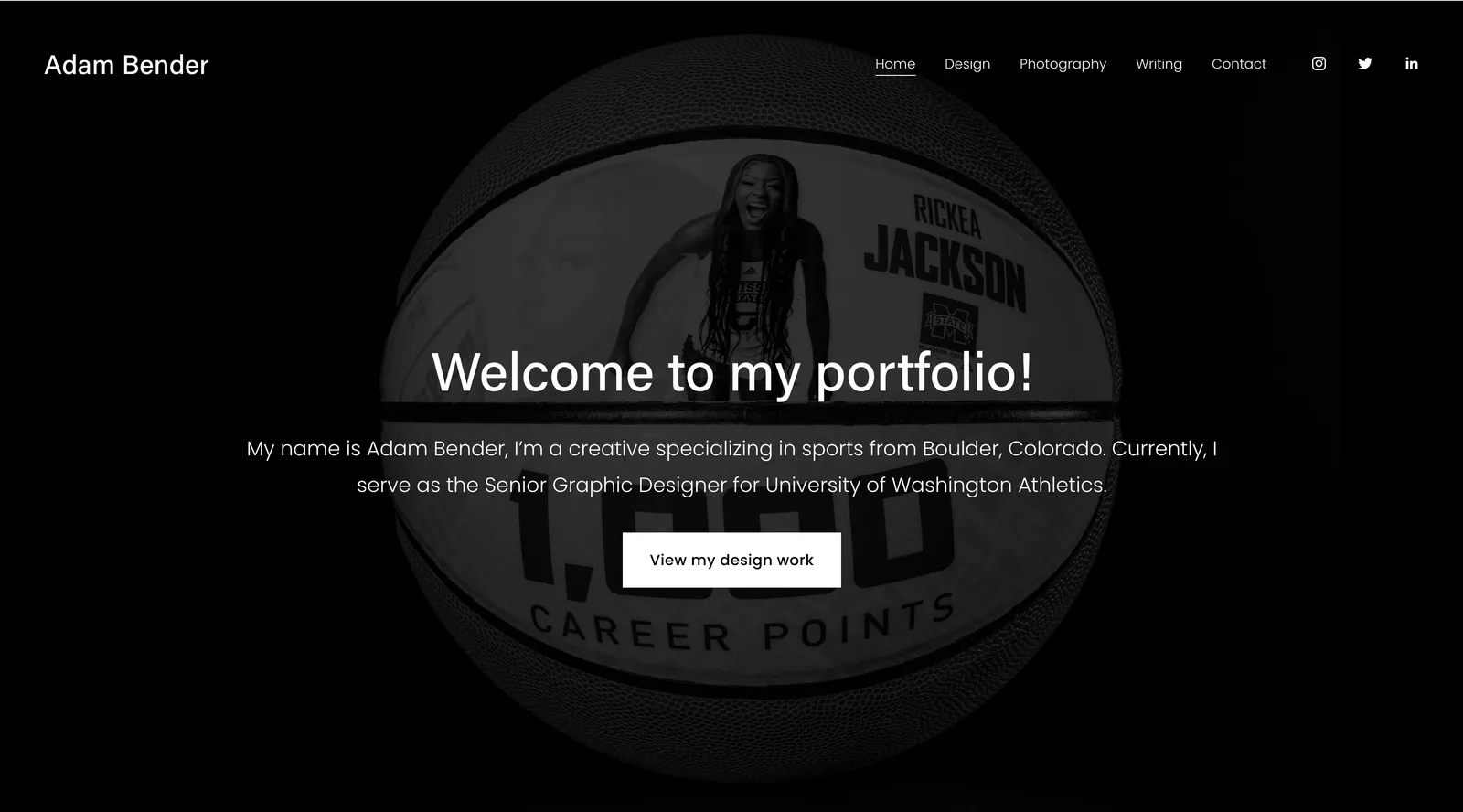
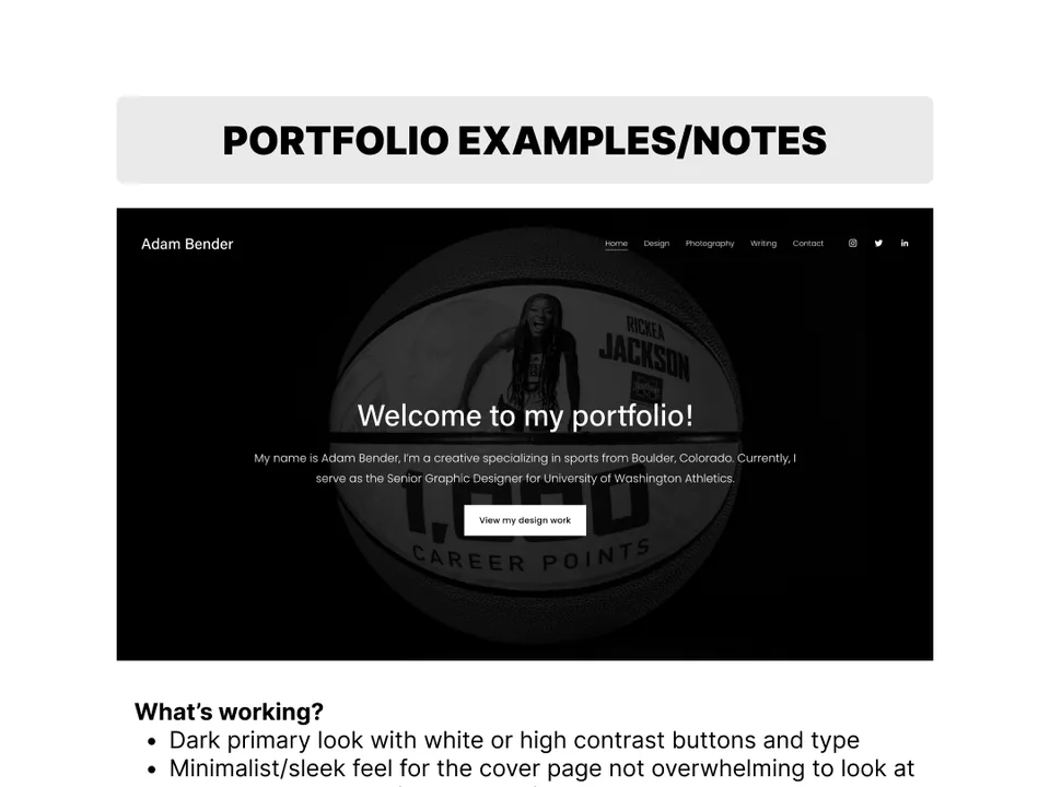
Old portfolio: landing page
Old portfolio landing page with a welcome message over a black and white basketball photo
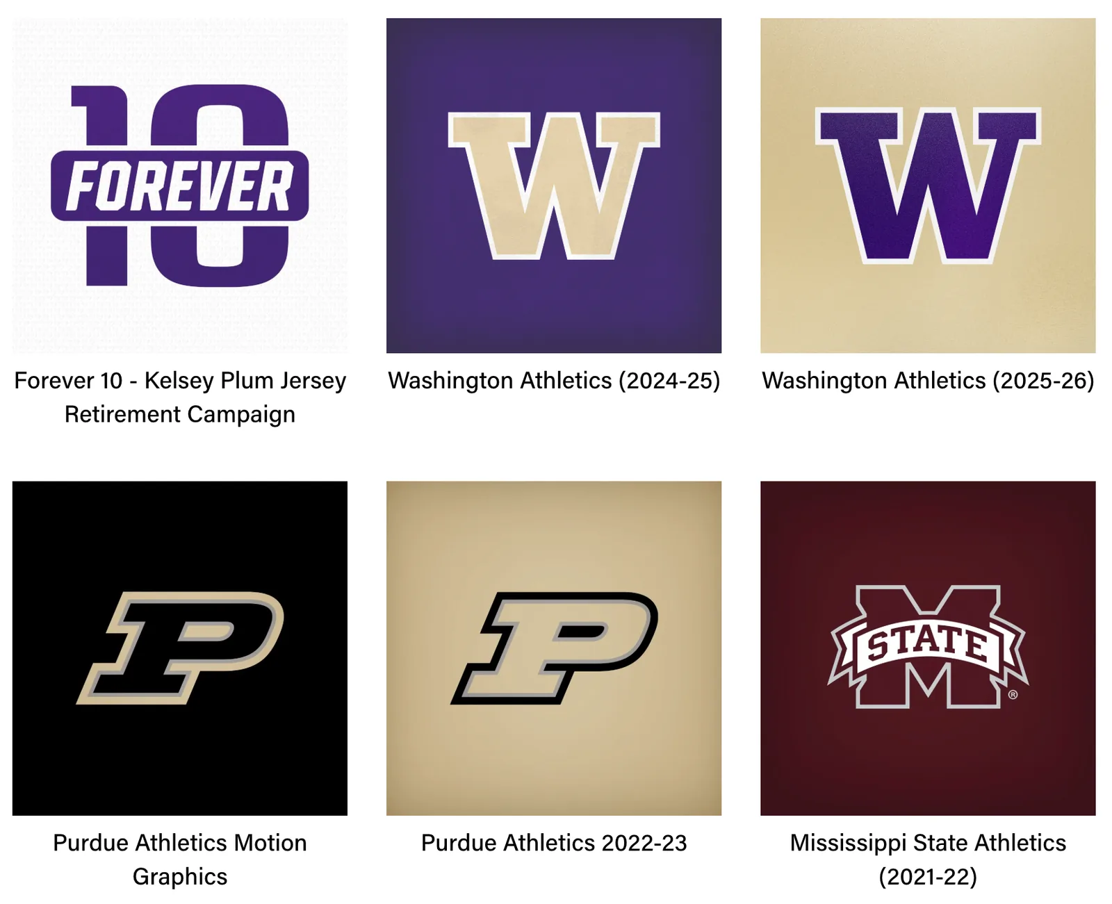
Old portfolio: work as promo tiles
Old portfolio work page: six logo tiles for Forever 10, Washington, Purdue and Mississippi State
Notes on my old portfolio
Notes board reviewing what worked and what fell short on the old portfolio
Design portfolio notes
Notes board on USP, layout and social proof, with reference screenshots blurred
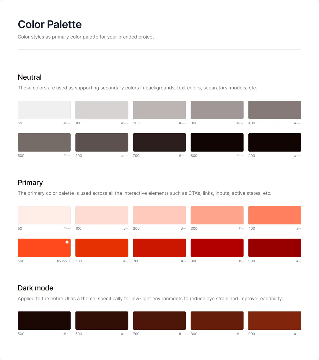
Early color palette
Early neutral, primary and dark mode color ramps

Layout from a Figma Masterclass template. Colors are mine.
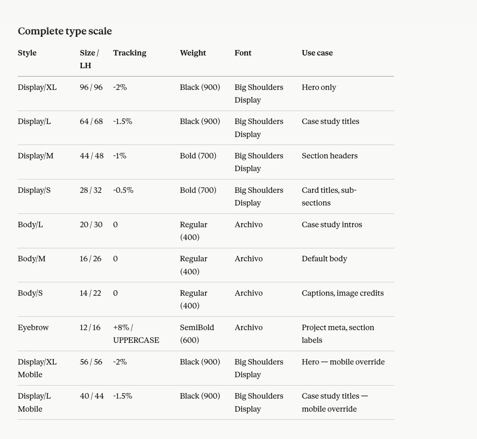
The type scale
Complete type scale table with sizes, tracking, weights and use cases

Drafted with Claude.

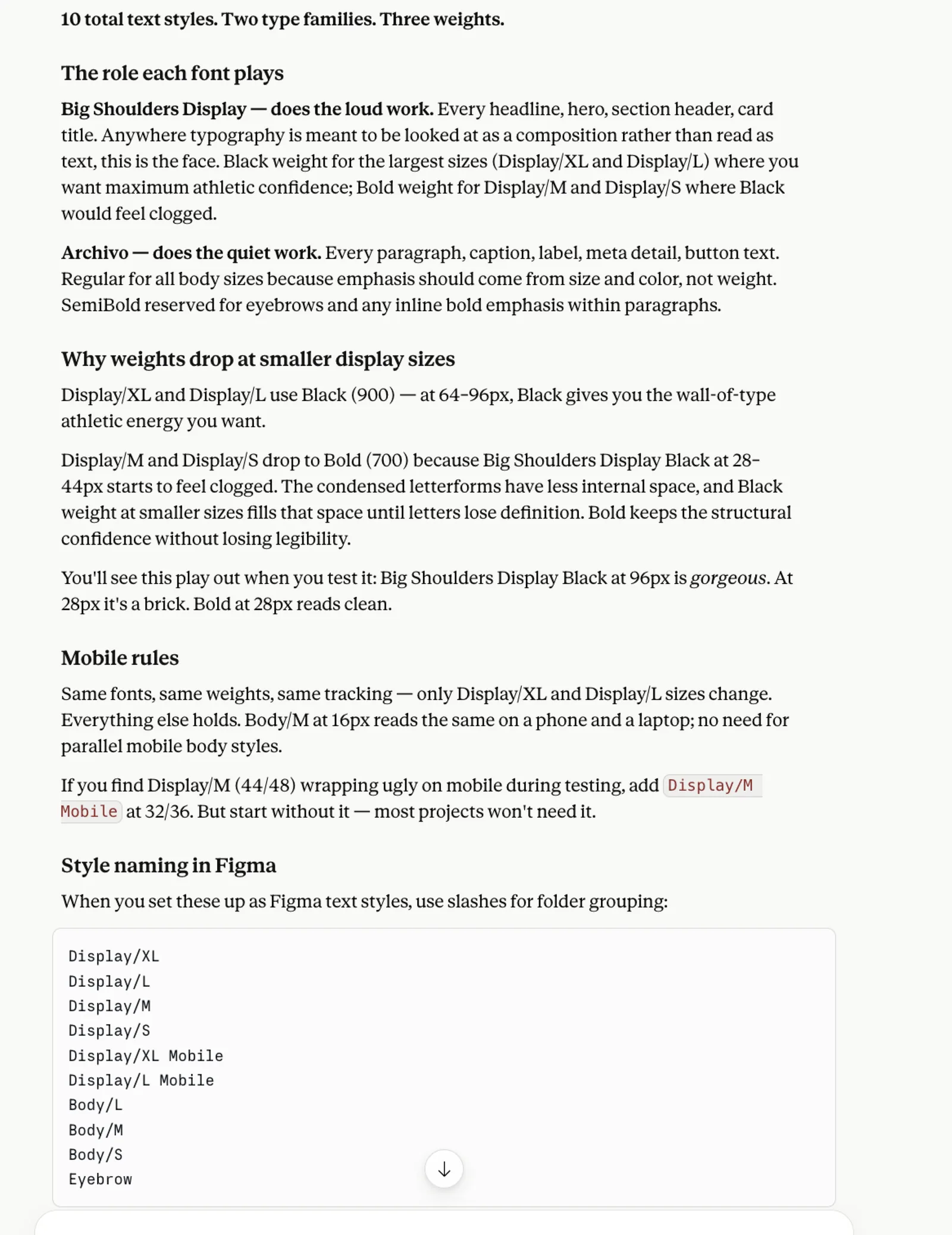
Why each style does its job
Notes on the role of each font family and when weights drop at smaller sizes

Drafted with Claude.

Working it through with Claude

I used Claude to get a baseline for type and spacing: what each style could be for, how sizes might scale down for phones, and when to use each spacing step. It was a reference point, not a rulebook. Every decision from there was mine.
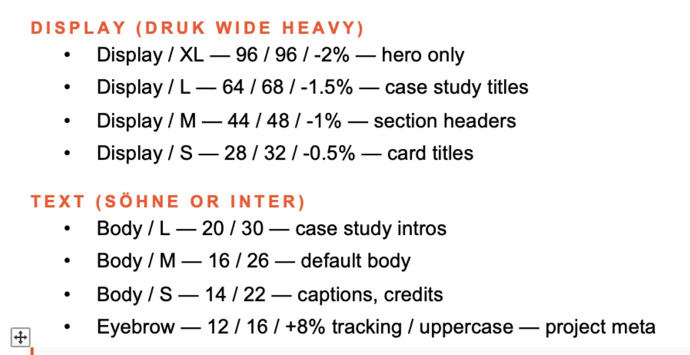
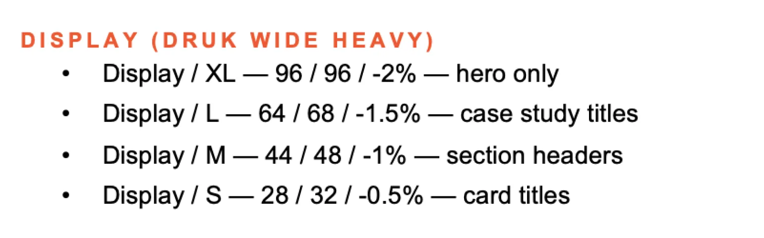
Type scale draft
Draft type scale notes for display and text styles
Display sizes
Draft display sizes and their uses
Mobile display sizes
Note on scaling Display XL down for phones
Mobile overrides
Note on swapping two type styles on mobile frames
Frame height
Note on letting frames grow vertically while the grid governs width
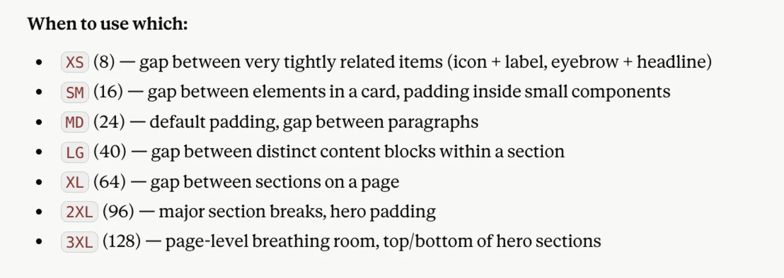
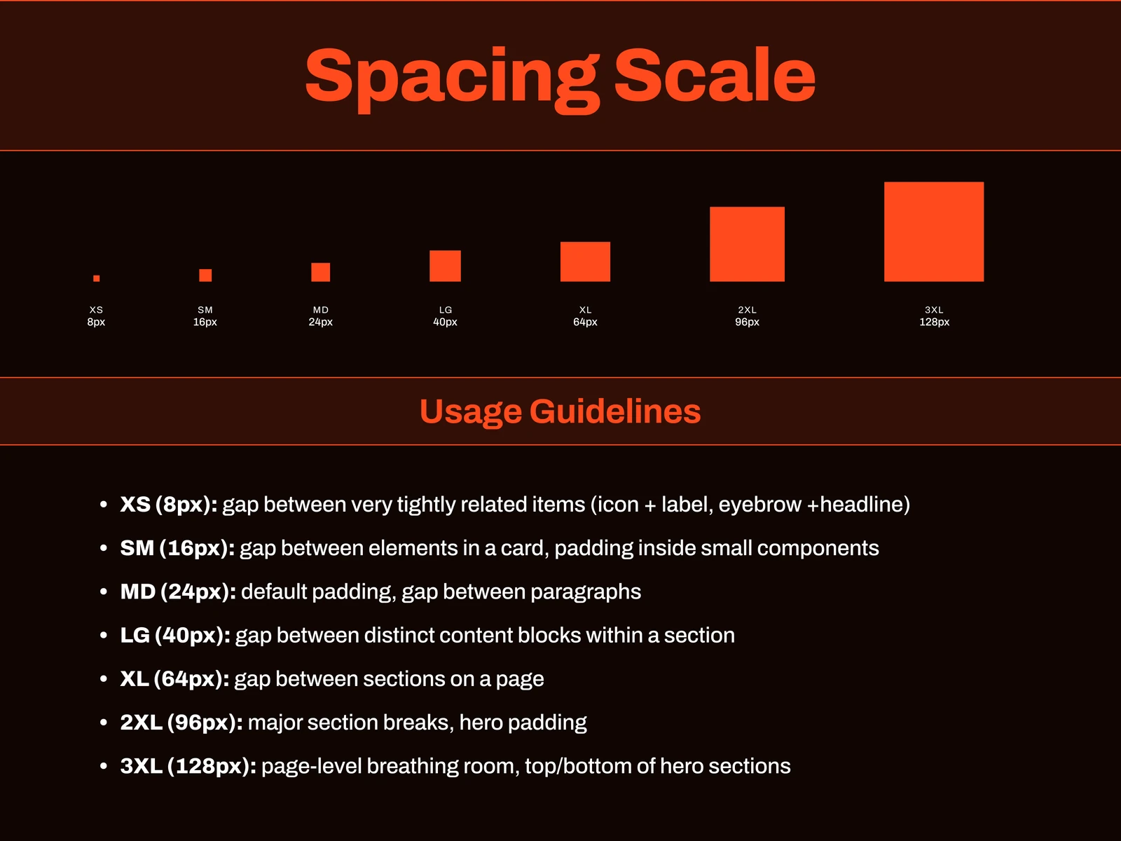
Spacing scale
When to use each spacing step, from XS to 3XL
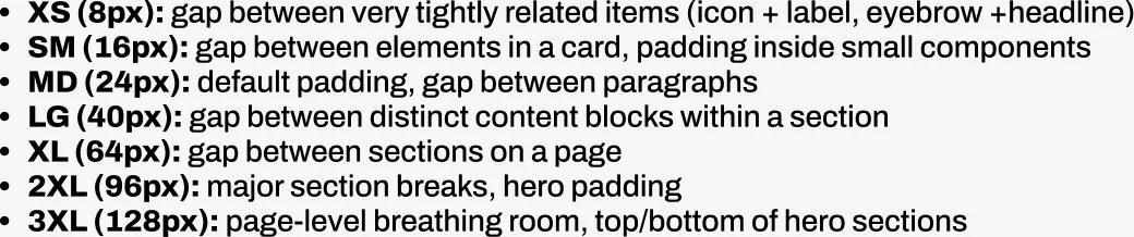
Spacing rules
Spacing scale rules written out in Figma
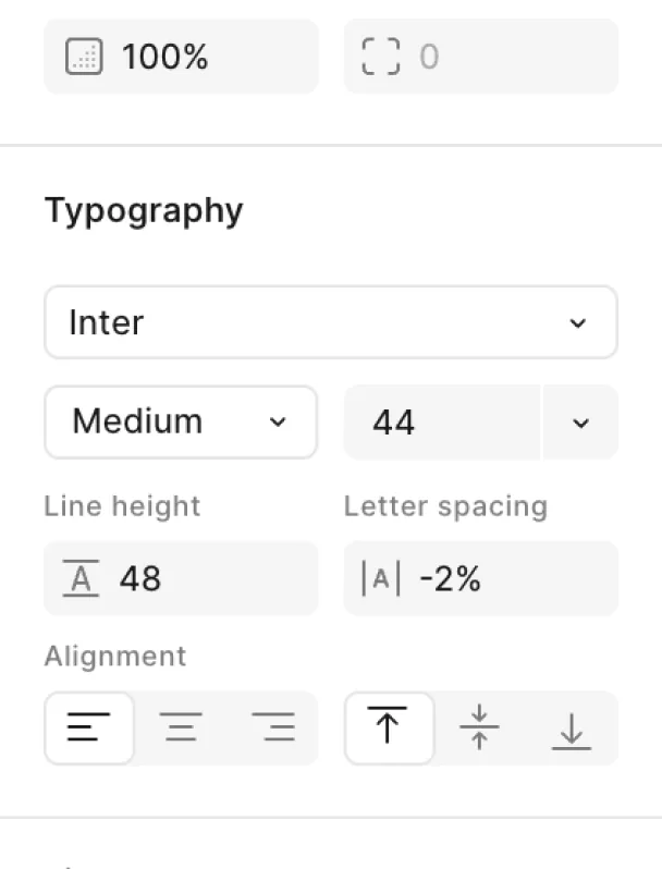
Type settings in Figma
Figma typography panel showing size, line height and letter spacing

02

Foundations

The decisions locked in as a published library: Signal Orange against a near-black background, two type families doing two different jobs, a seven-step spacing scale and a 12-column grid (four on phones).
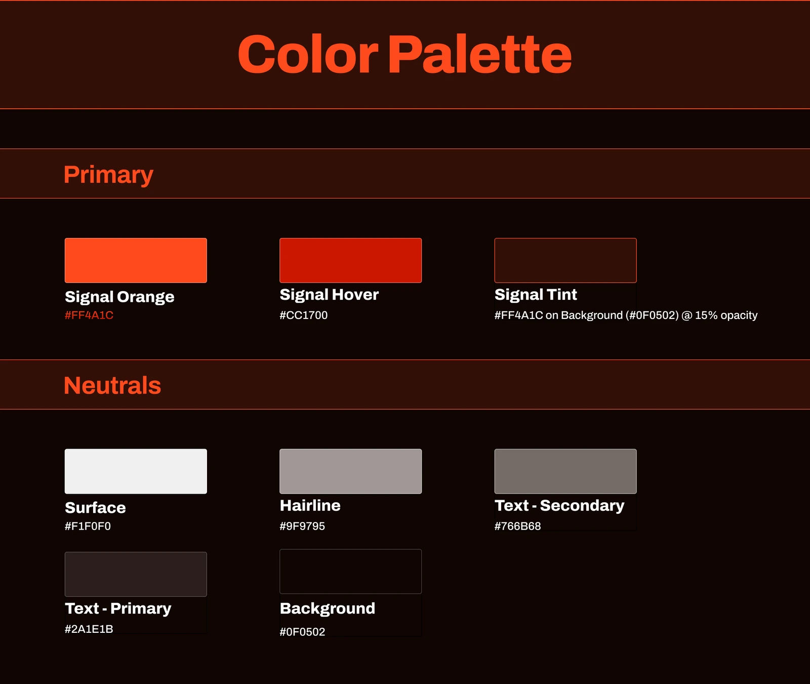
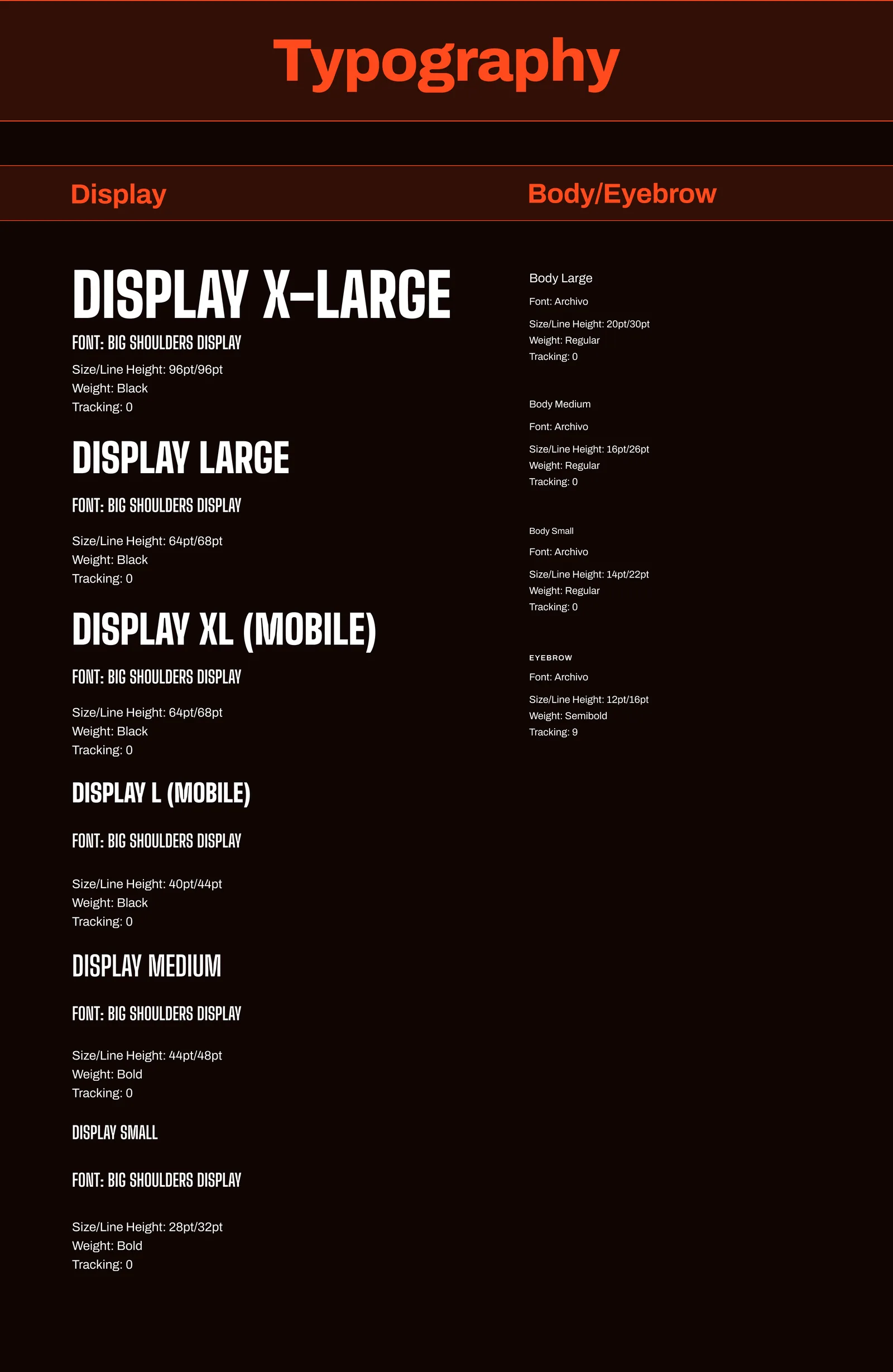
Color palette
Color palette: Signal Orange, Signal Hover, Signal Tint and five neutrals
Typography
Typography: Big Shoulders Display and Archivo styles with sizes and weights
Spacing scale
Spacing scale from XS 8px to 3XL 128px with usage notes
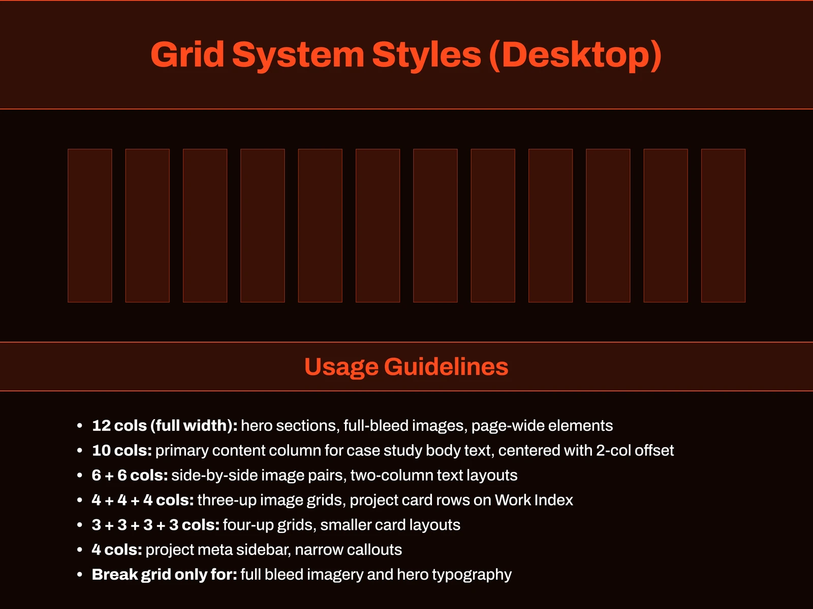
Grid: desktop
Desktop grid: 12 columns with 120px margins and usage guidelines
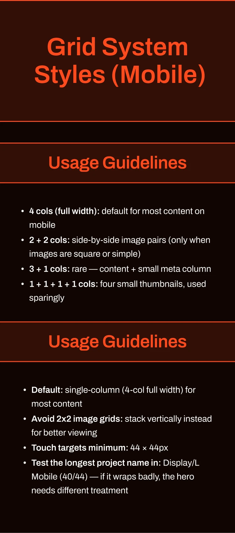
Grid: mobile
Mobile grid usage guidelines and rules

03

Components

Every repeated piece of the site built once, with its states: navigation, buttons, case study cards, Next Project and the footer, plus reusable image blocks and animation players.
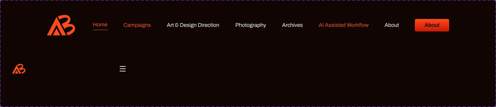
Navigation bar: desktop and mobile
Navigation bar component in desktop and mobile versions
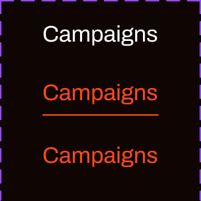
Nav link: default, active, hover
Nav link in default, active and hover states
About button: default, hover, active
About button in default, hover and active states
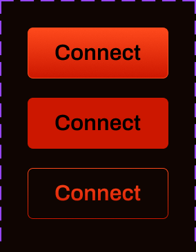
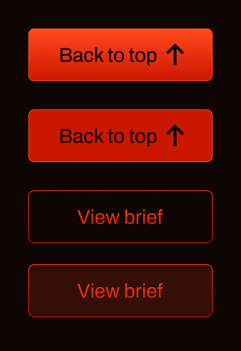
Signal Orange button: four states
Signal Orange button in default, hover, dark and dark hover states
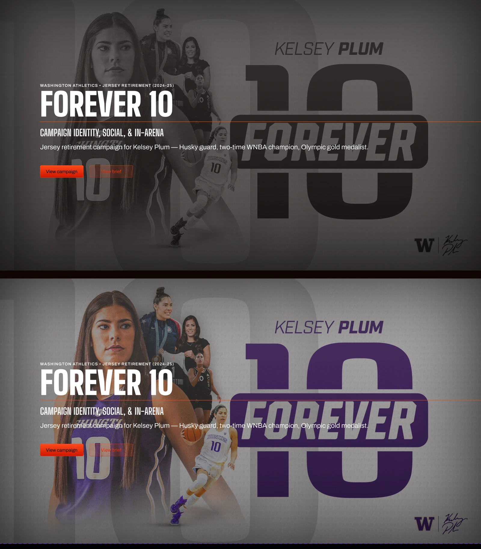
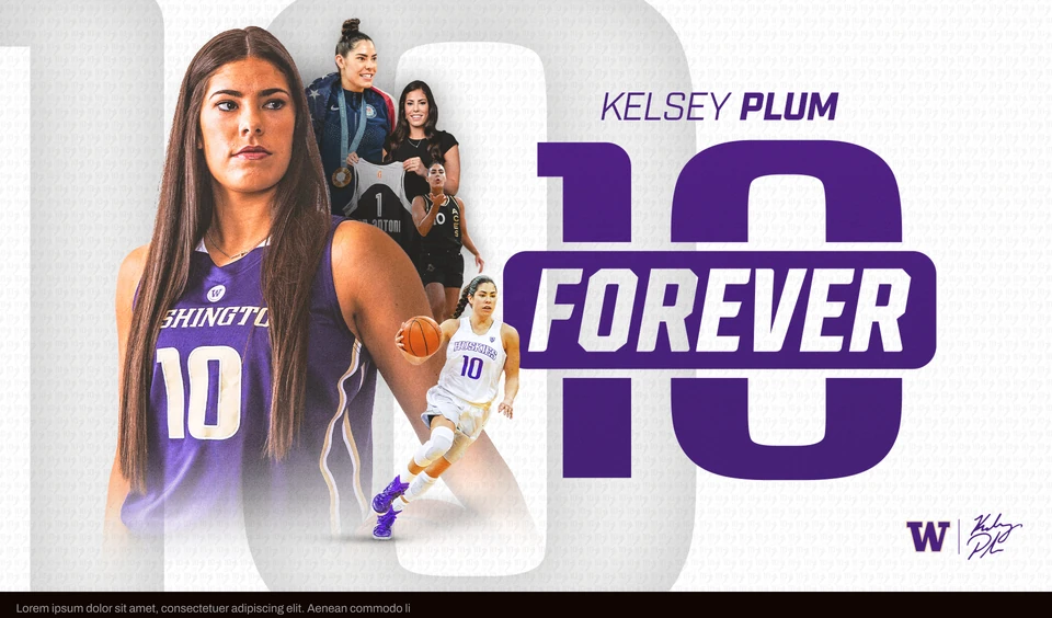
Case study card: Forever 10
Forever 10 case study card in default and hover states
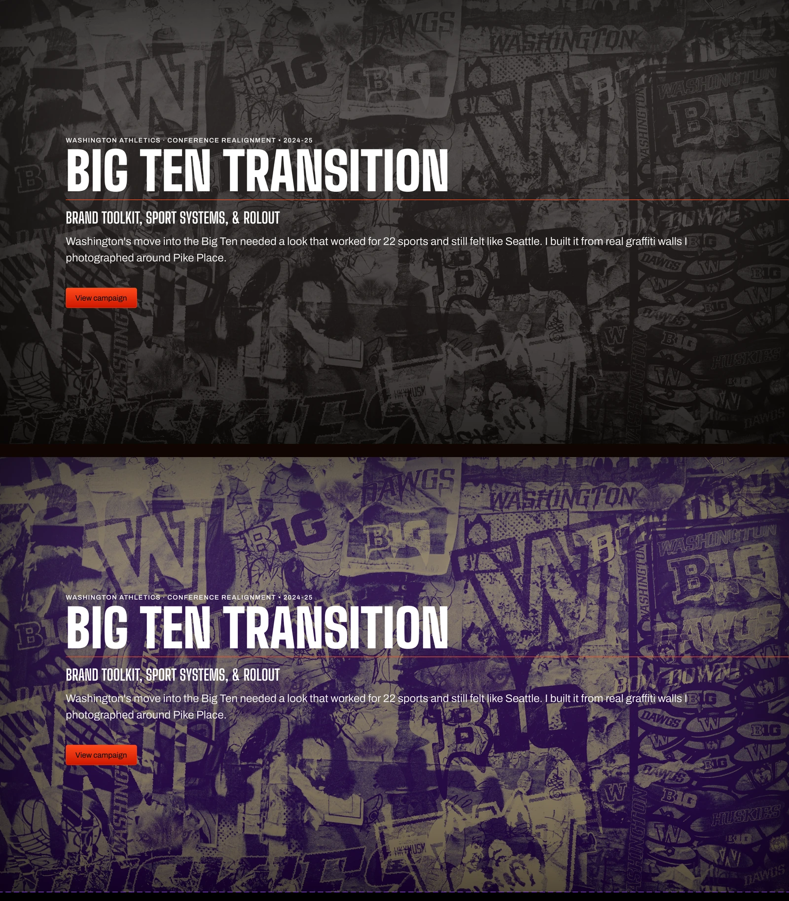
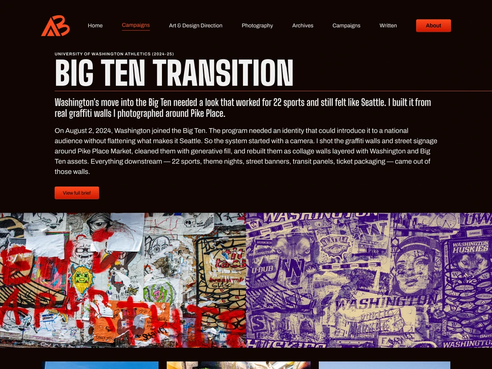
Case study card: Big Ten Transition
Big Ten Transition case study card in default and hover states
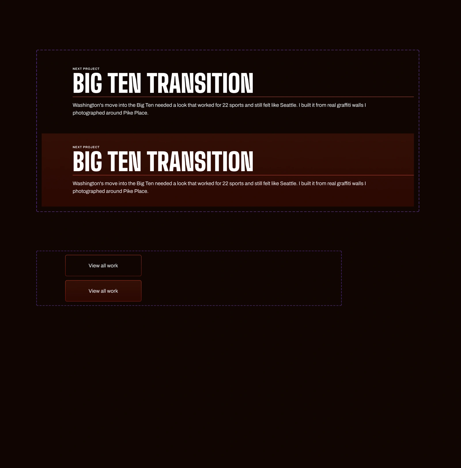
Next Project and View all work
Next Project and View all work components in default and hover states
Footer
Site footer component with contact, page links and social links
Image blocks
Reusable Forever 10 image block layouts
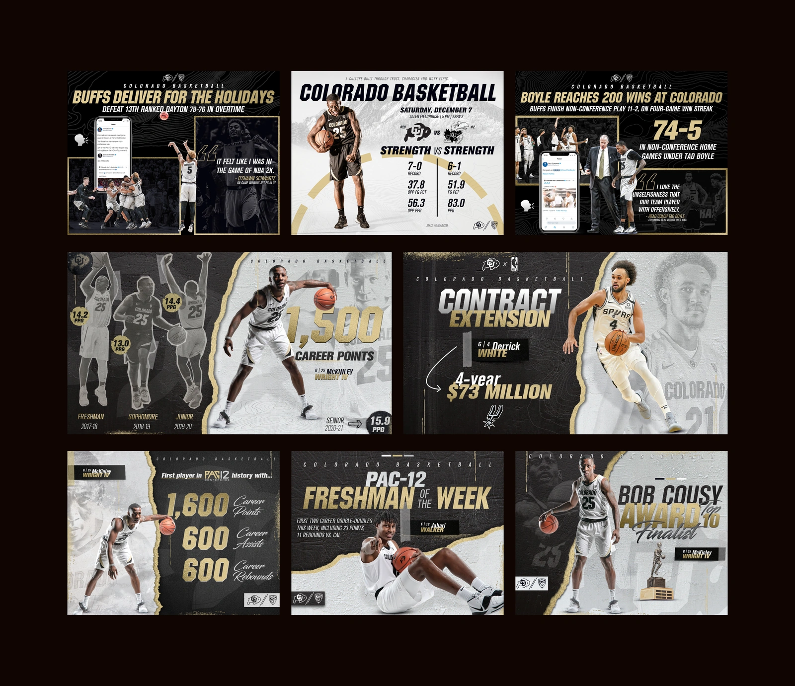
Image blocks: Colorado
Colorado image block layouts for mailers, 16:9 and 5:4 graphics
Animation player: cover, then playing
Purdue Our State animation

04

Pages

Twelve pages designed from the library. Open any page to see the full design, or visit the live version.

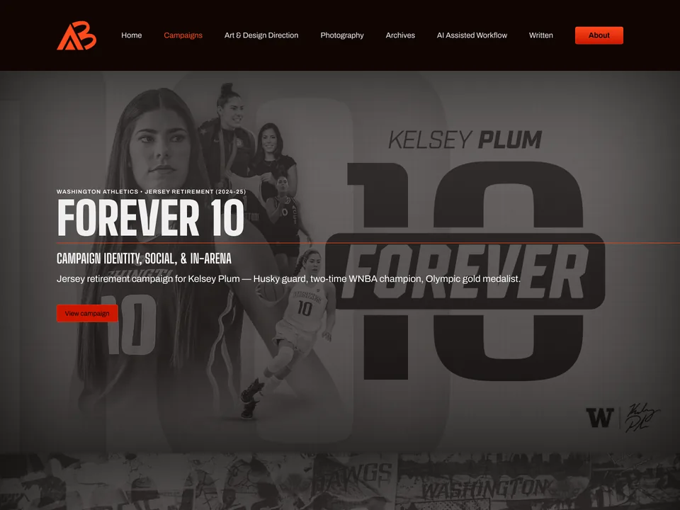
Home page design in Figma
Home
View live page
Campaigns page design in Figma
Campaigns
View live page
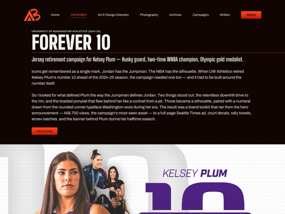
Forever 10 page design in Figma
Forever 10
View live page
Big Ten Transition page design in Figma
Big Ten Transition
View live page
Art & Design Direction page design in Figma
Art & Design Direction
View live page
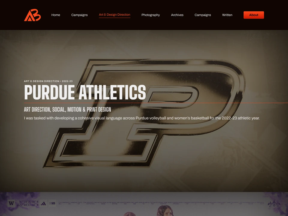
Purdue Athletics page design in Figma
Purdue Athletics
View live page
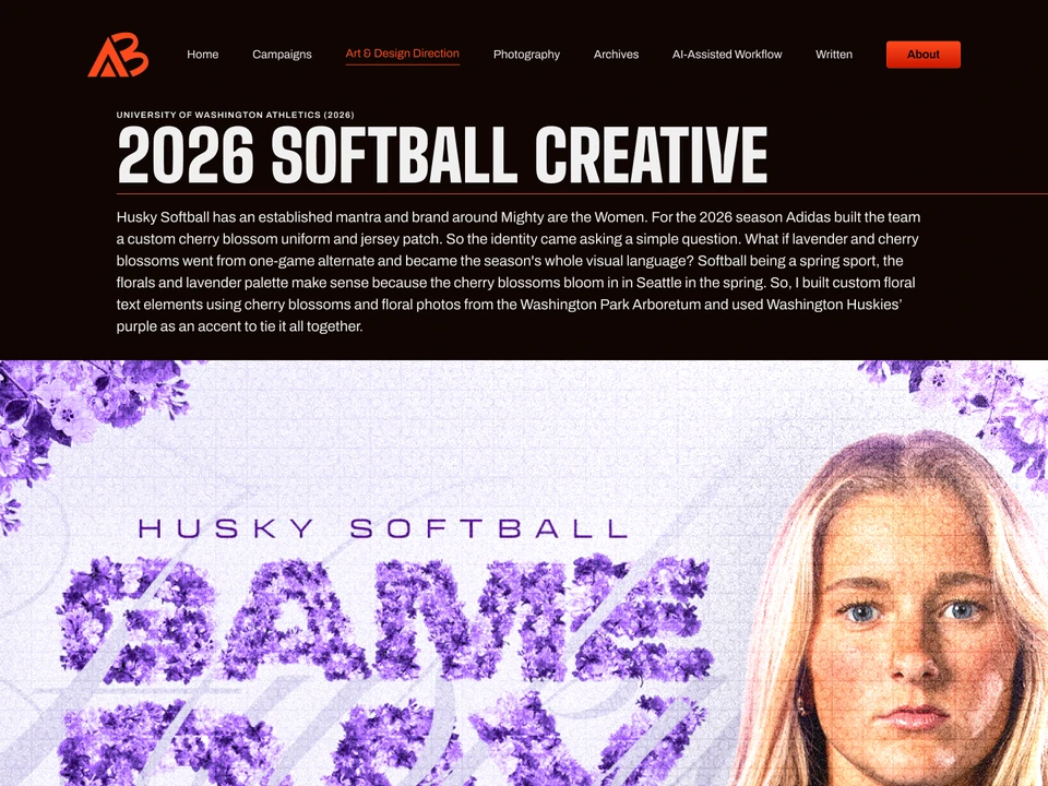
Washington Softball page design in Figma
Washington Softball
View live page
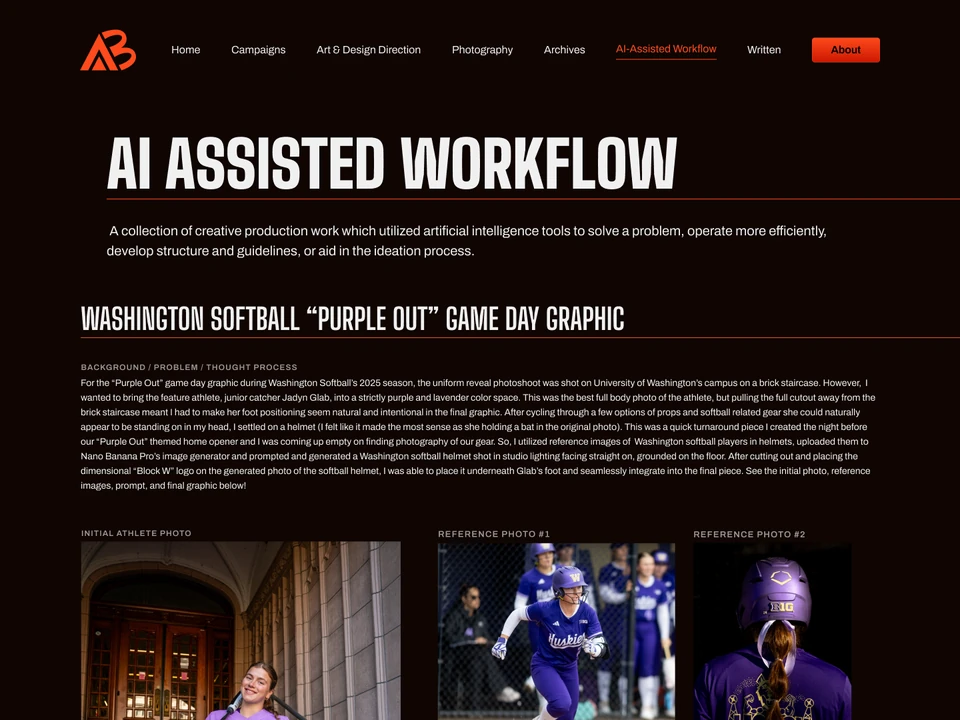
AI-Assisted Workflow page design in Figma
AI-Assisted Workflow
View live page
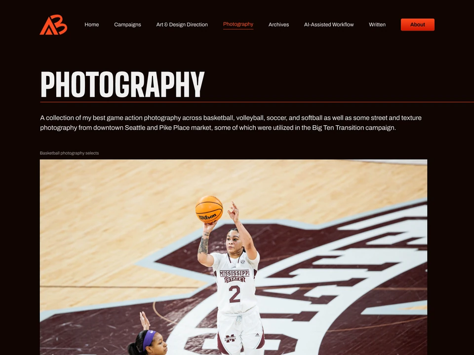
Photography page design in Figma
Photography
View live page
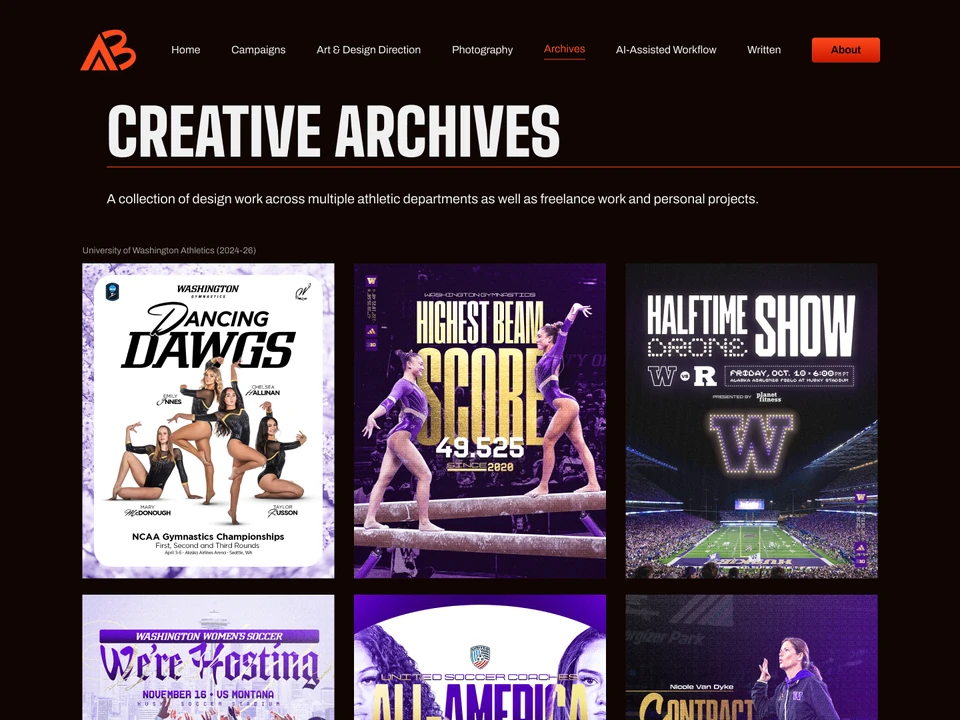
Creative Archives page design in Figma
Creative Archives
View live page
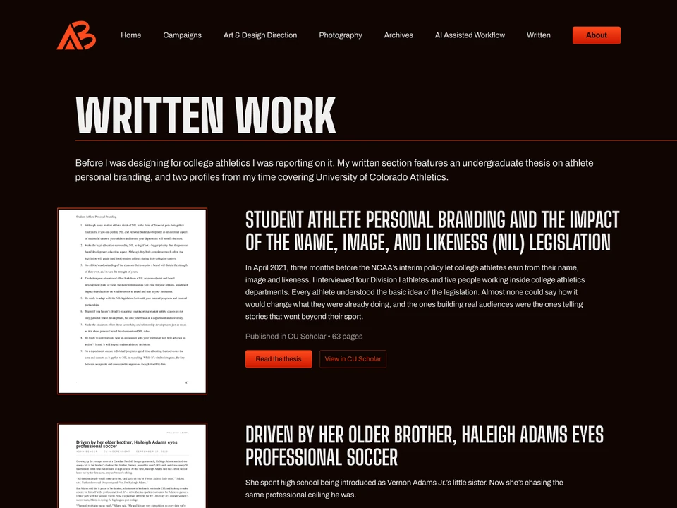
Written Work page design in Figma
Written Work
View live page
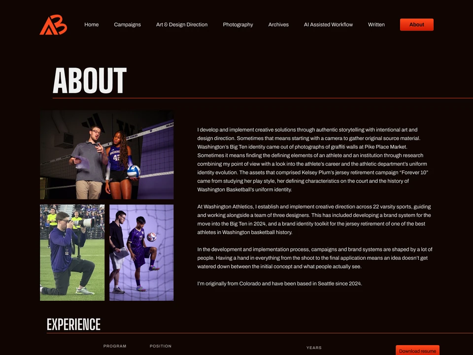
About page design in Figma
About
View live page
Next project PHOTOGRAPHY A collection of my best game action photography across basketball, volleyball, soccer, and softball as well as some street and texture photography from downtown Seattle and Pike Place Market, some of which were utilized in the Big Ten Transition campaign.
View all work