Washington Athletics’ Big Ten Transition (2024-25)
The Problem: Washington's move into the Big Ten required a scalable visual identity that could introduce the program to a new national audience while staying grounded in what makes UW distinctly Seattle.
The Decision: The campaign was anchored in the physical texture of Seattle itself, real graffiti walls photographed near Pike Place Market, cleaned with generative fill and rebuilt with Big Ten, Washington, and Seattle-specific visuals layered in.
The Outcome: A flexible design system that scaled across 22 sports and multiple channels, launching on August 2, 2024 when Washington officially joined the Big Ten.
The two collage walls featured above were used most throughout the campaign. They were the two non-sport specific walls, which allowed them to be utilized across sports. One features exclusively University of Washington athletics wordmarks, visuals and Big Ten conference logos and the other combines Washington athletics assets with photos taken around Seattle’s Pike’s Place Market.
Above are some of photos I took around Pike’s Place that were incorporated into the Seattle specific collage wall.
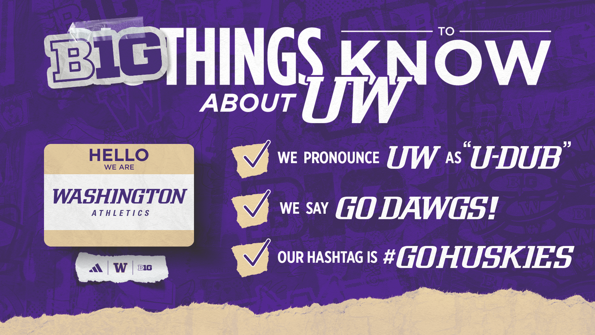
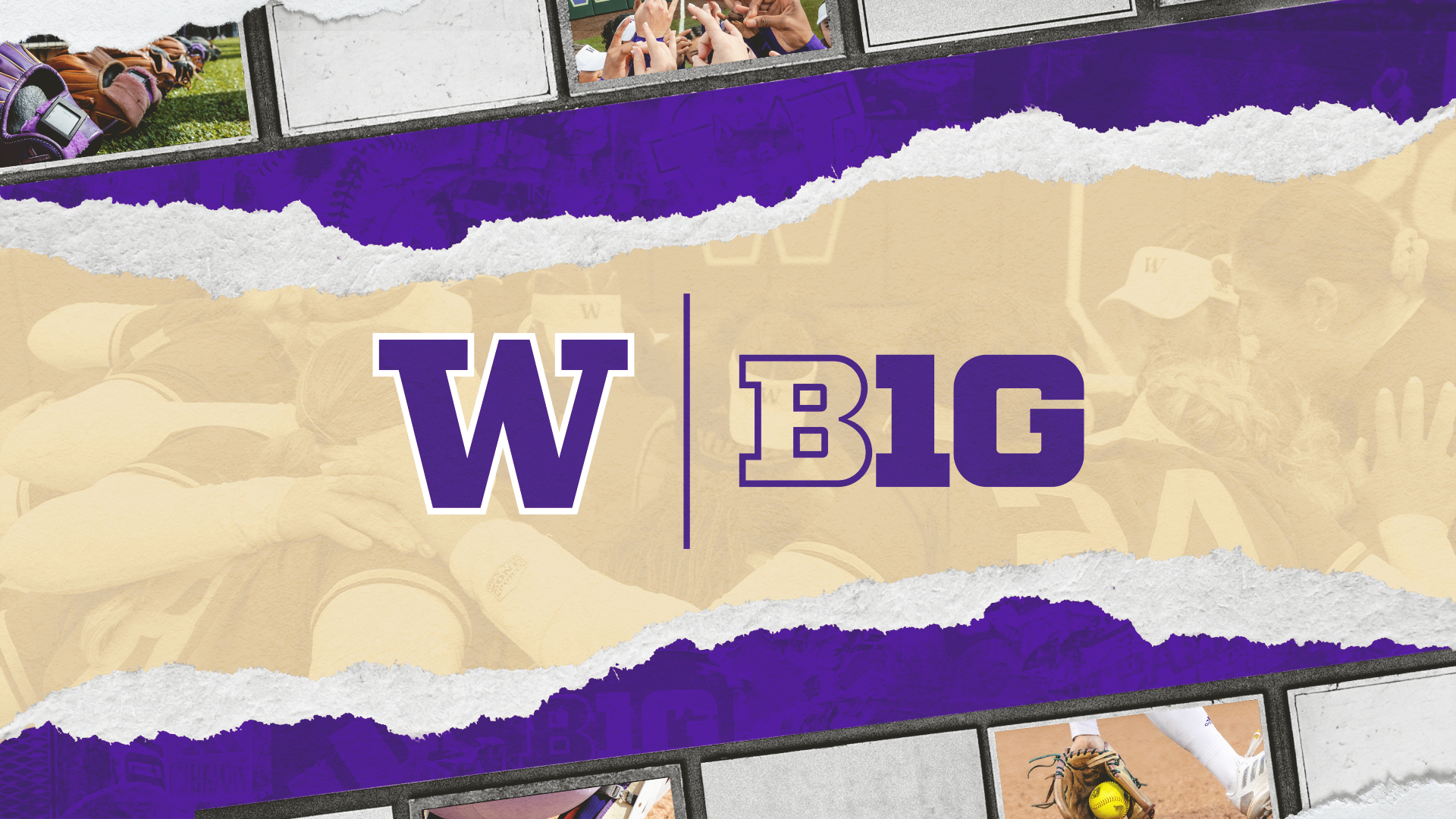
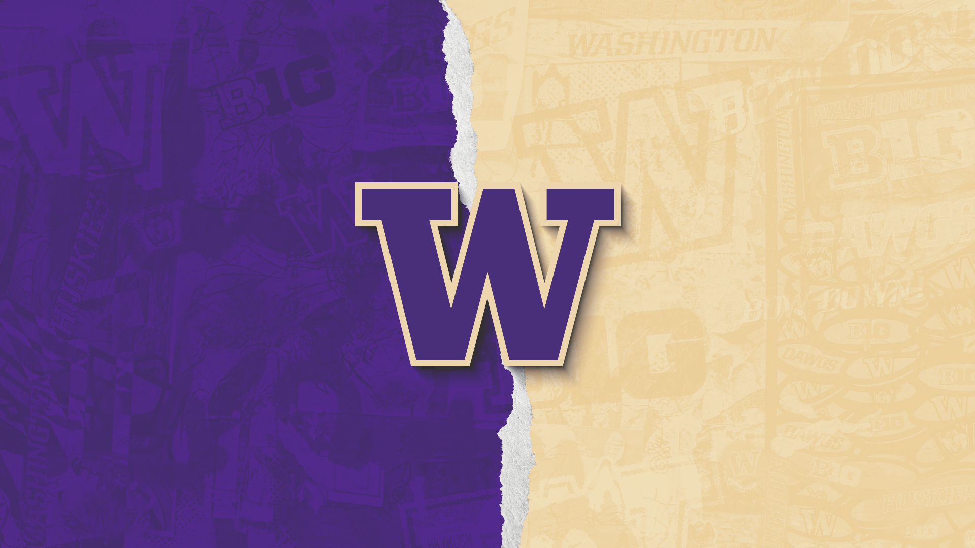
A few of the assets that were released on the day Washington joined the Big Ten: August 2, 2024. Including “ B1G Things to Know”, one of the sport-specific hero graphics each sport account posted (softball showcased above), and a graphic showcasing UW’s colors.
Mixed media Instagram carousel designed to introduce Washington to a new audience placing an emphasis on the uniqueness of its location. To see the social post, click here!
2024 Washington football ticket box designed for our premium season ticket holders with elements from the Big Ten transition.
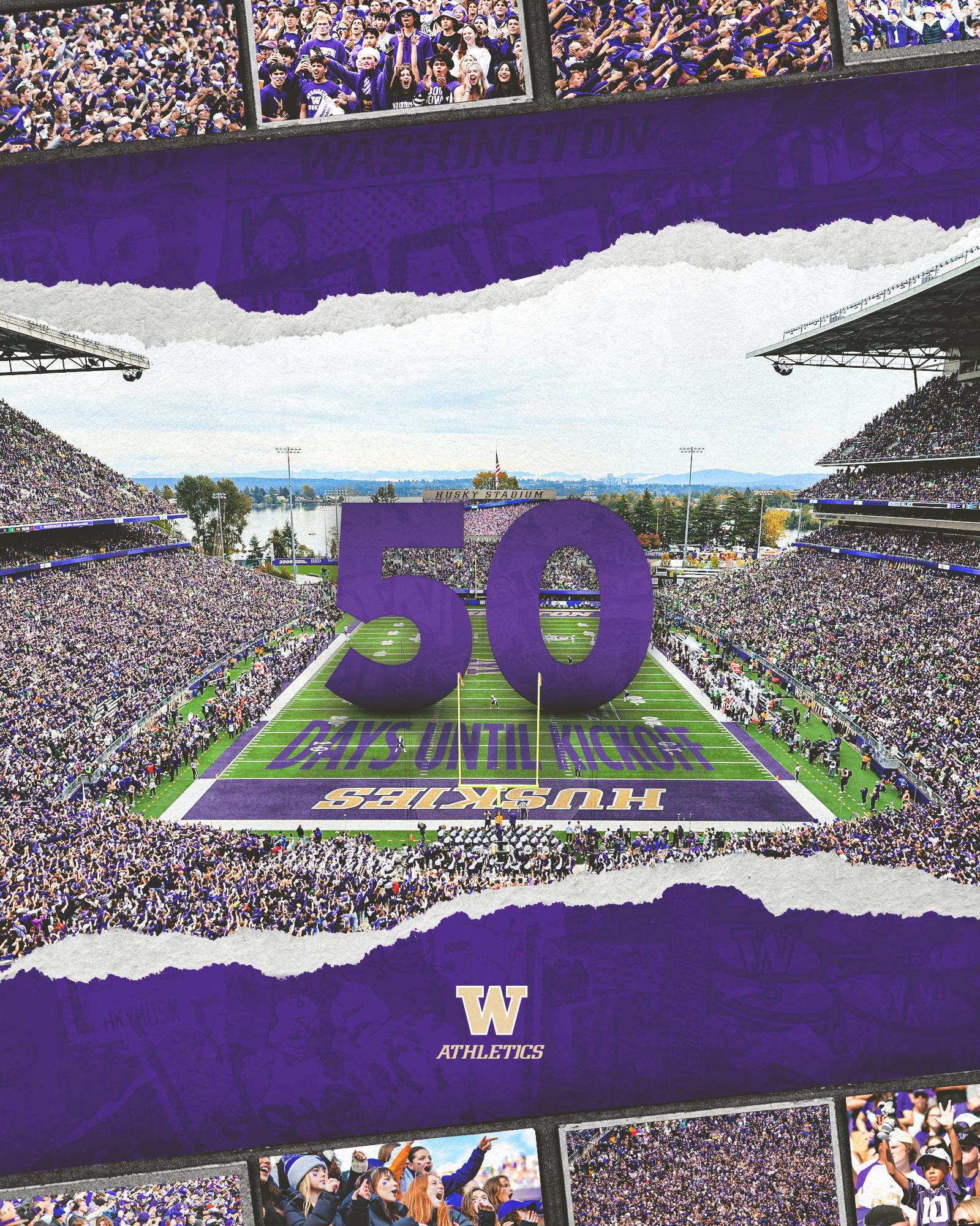
Here’s a glance at how the some of the key design elements were incorporated into athletics and sport specificdesign work including the graffitied, collage walls and the repeating logo border elements I built from the second photo from the previous section of a wooden sign at Pike’s Place.
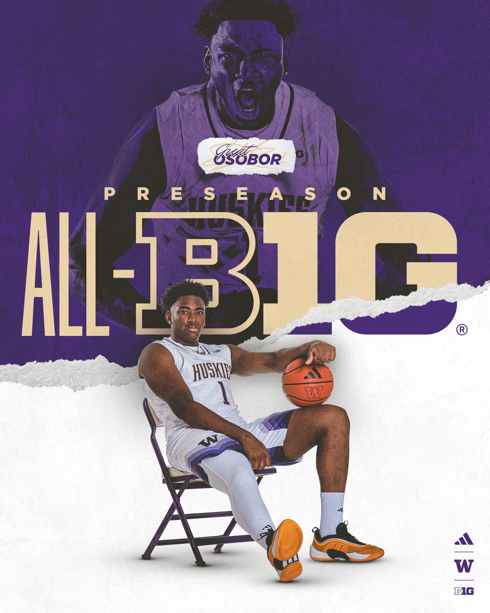
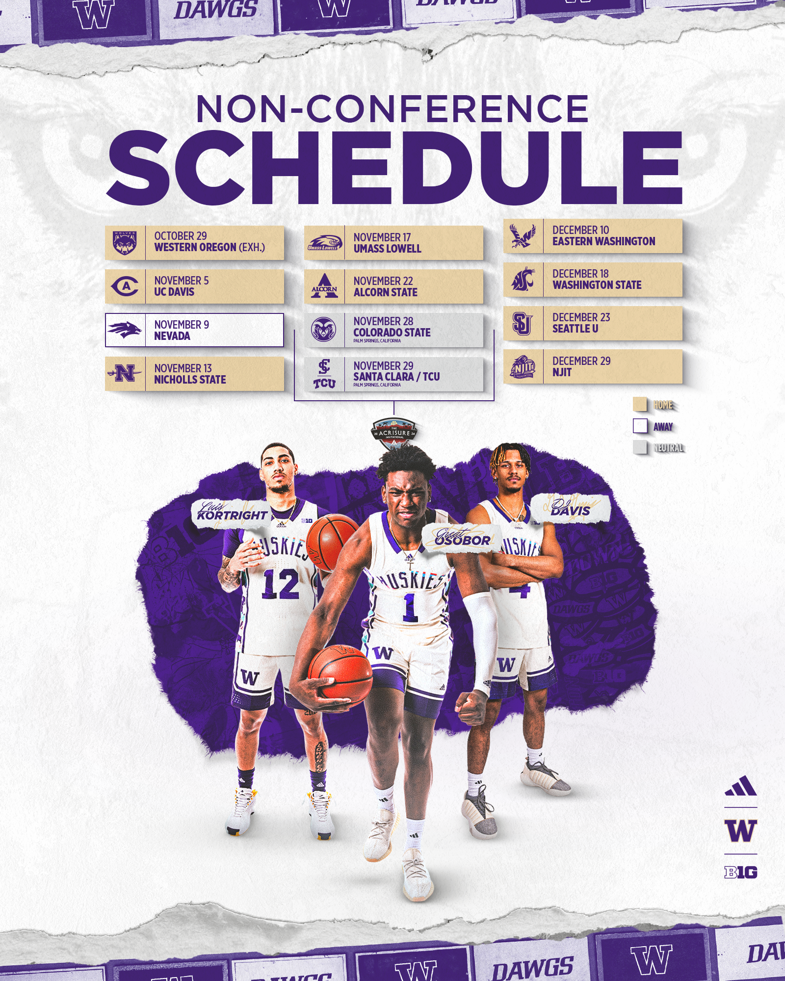
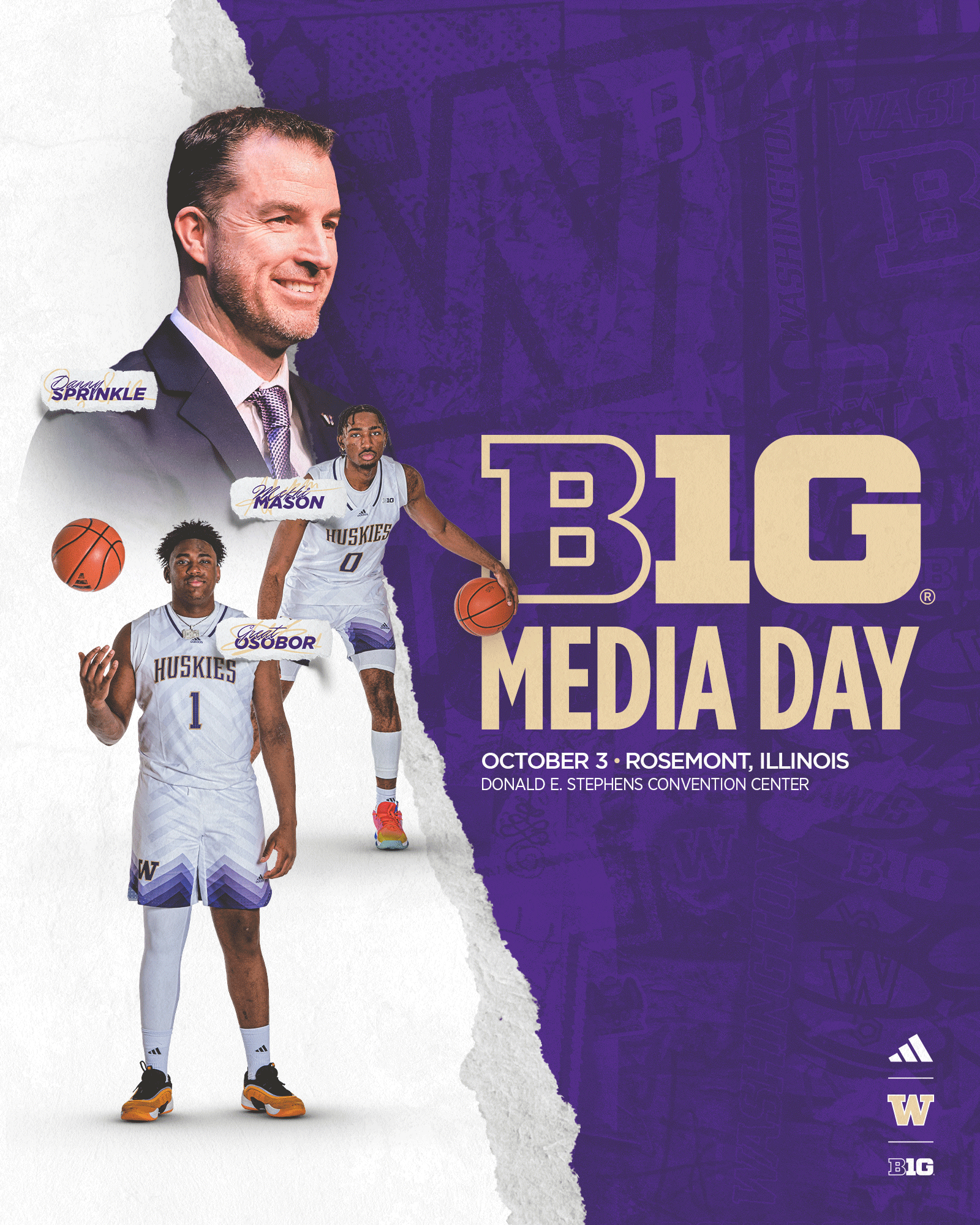
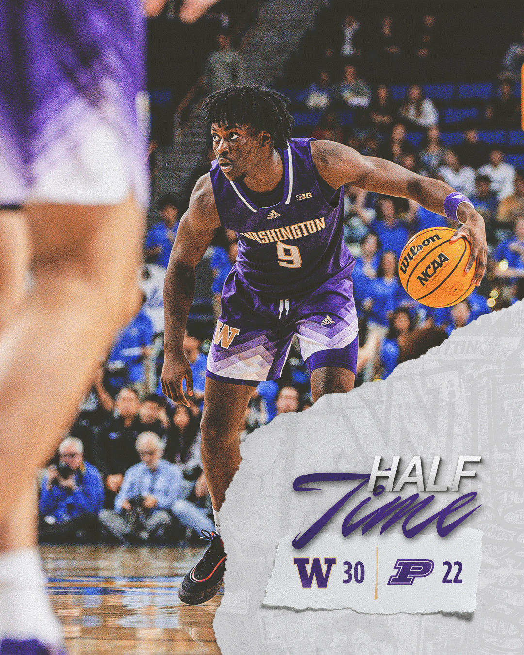
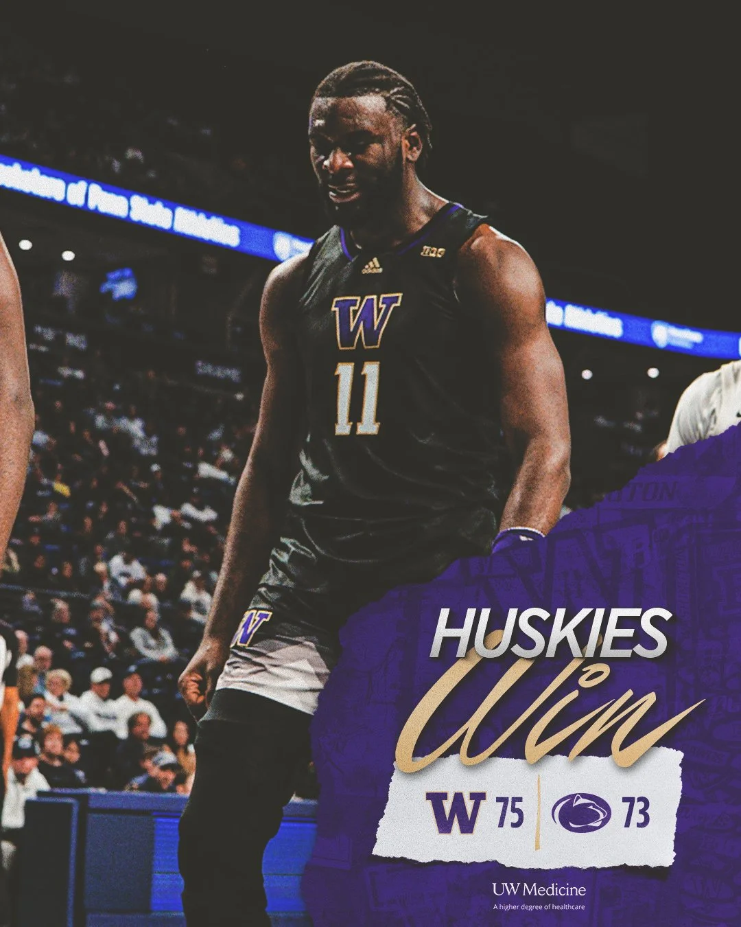
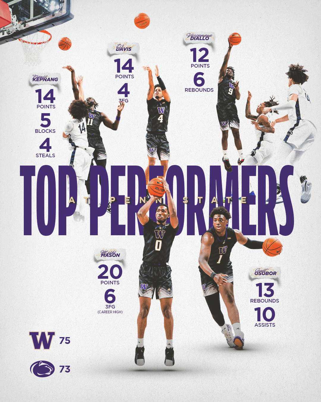
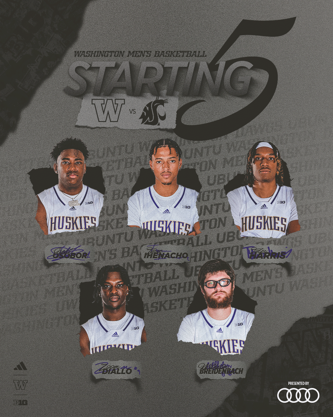
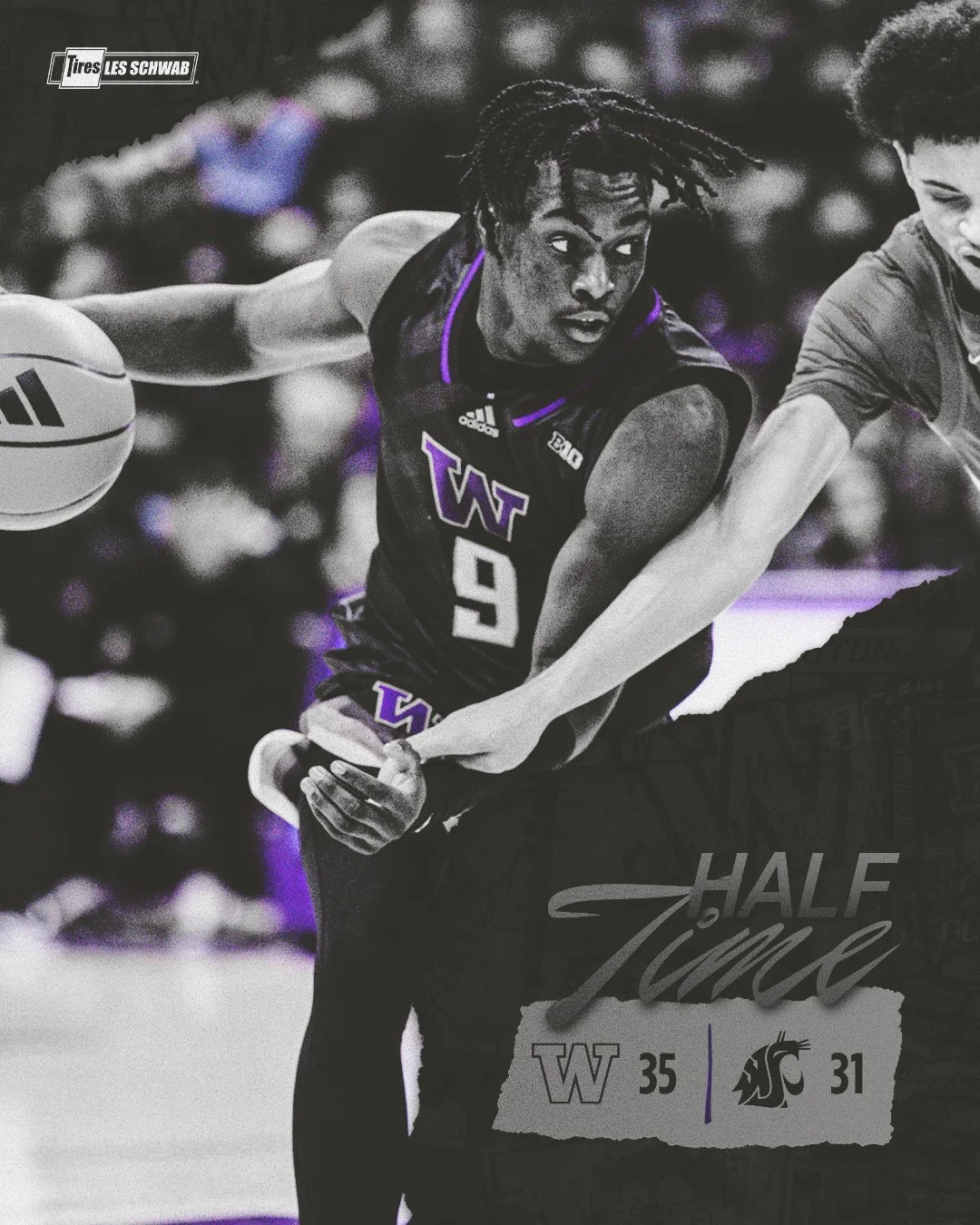
In men’s basketball specific branding the same overall style, tear elements, and wall patterns persist from athletics branding with a handful of sport specific elements integrated.
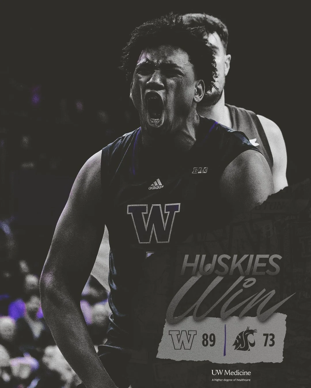
Throughout the 2024-25 men’s basketball had a handful of home game theme nights. The graphics shown above are from the “Black Out” game versus Washington State.


